Generation NYC Topic page
Redesign a digital resource page to support NYC teens and young adults experiencing homelessness.
Services
- Information architecture
- User research
- Editorial workflow and governance
- Project management
- Copywriting
- Plain language
Background
In late 2018, a City task force on youth homelessness approached the digital products team at the Mayor’s Office for Economic Opportunity. They wanted a resource for young people experiencing homelessness that “met them where they are.”
Our team’s product, Generation NYC, takes a conversational, topic-based approach to connect teens and young adults to City resources. While the mobile-first site already had a page for “runaway and homeless youth,” we set out on a redesign to make the page more comprehensive and reflective of our users’ needs.
What I did
Project management
The page redesign involved four primary sets of the stakeholders: youth who have experienced homelessness; the agency responsible for overseeing youth homelessness services; City-funded non-profits that provide services; and the task force. I coordinated research and reporting with each stakeholder group, developing a governance model and a four-month project and editorial process.

User research
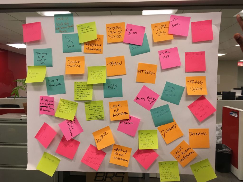
Research methods for the project ranged from desk research (reports, articles) to interviews with City agencies and providers.
For the primary set of stakeholders, a group of young adults with homelessness experience, my team set up two workshops—one at the beginning of the project to better understand our users’ needs, and one towards the end to gauge the success of the page. Methods for the former workshop included design probes and journey mapping. For the latter, we ran a highlighter test to focus on content outside the context of our UI, as well as a usability test to assess user experience.
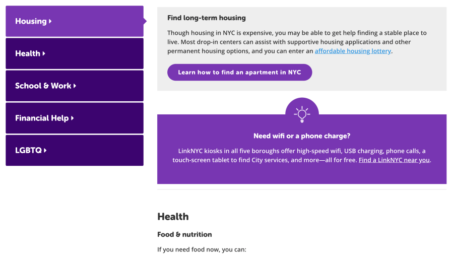
Information architecture
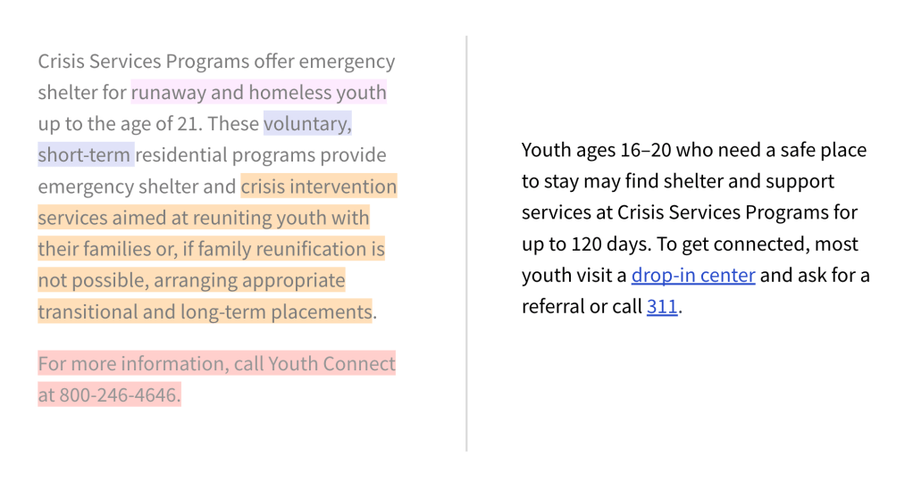
With the volume of information our research surfaced and stakes inherent to the subject matter, it was important to organize the page in a digestible way. I broke it down into category and sub-category of need; prioritized each according to urgency; and labeled each using language we had uncovered or vetted through user research.

Results
Defining “success” for a project like this is tricky since every uptick in numbers in our site analytics represents more vulnerable young people with urgent needs. With that said, our redesign has helped connect more people to services to address these needs. Visitors to the page, primarily coming from search engines, have increased by 150%. Engagement (measured by visits to offsite links), has increased by 70%.
